Why “joie theory :) 喜理” Looks the Way It Does
The process of creating the hoodies began organically. First, there were the Black Joy hoodies, inspired by the Black Joy Parade. Then there was the question, what about my kids’ Asian side, that inspired the Lunar New Year Greetings hoodies. Lastly, there was the Buddhist in me who wondered about how to externalize my faith in a visible and tangible way that resulted in the Buddhist Inspirations hoodies.
Then came the question of how to bring all these hoodies together under a common label. When I considered all the designs, I realized that a common thread wove them together—joy.
- The Black Joy hoodies all had the word ‘joy’ in the front already.
- The Lunar New Year Greetings hoodies brought tidings of joy.
- The Buddhist Inspirations hoodies came to be because the entire purpose of Buddhist practice was about eliminating suffering and creating absolute happiness.
So it made sense to have the concept of joy in the branding.
Then another question surfaced:
If joy is the thread that connects everything—how do you give that thread a form?
- How do you name it?
- How do you write it?
- How do you design it in a way that holds all of these meanings at once?
That question became the foundation for everything that followed.
Why “joie theory” in “joie theory :) 喜理”
We chose the name joie theory knowing that “joie” is not an English word.
And that was intentional.
“Joy” is familiar. Immediate. Easy to recognize.
But “joie” slows you down—just slightly. It asks you to look again, to consider it more closely. It carries a sense of care, of something chosen rather than assumed.
Not because it is French—but because it creates a small moment of attention, and offers a subtle nod to a global, cross-cultural identity.
In our family, language is not just about communication—it’s about relationship. If my kids were living with their grandparents in Africa, they might move between English to engage the world, French to delight their grandmother, Yoruba with their cousins, and Chinese with my parents.
“Joie” lives somewhere in that in-between space—familiar, yet just distinct enough to invite you to look again. In fact, for an English speaker who does not know the pronunciation, they might even try to say it as “joy.”
And maybe that moment—the willingness to try, to engage, to meet it halfway—is where joy often begins.
Why 喜理 in “joie theory :) 喜理”
If joie theory is the name in Romanized letters, then 喜理 is its foundation in Chinese characters.
喜 is joy—not just happiness, but shared joy, celebratory joy, connective joy.
理 is principle, logic, the underlying structure of how things work.
Together, they form something deeper than a direct translation:
A way of understanding joy.
A belief that joy has form.
That it can be practiced, cultivated, and sustained.
Why Kai Style Calligraphy
We chose 楷书 (Kai style) for how it holds structure.
It is clear. Grounded. Balanced.
There is no ambiguity in its form—it is steady, legible, and disciplined.
That felt important.
Because joy, in this context, is not fleeting or chaotic. It is something we return to with intention. Something we build with clarity.
Why We Moved from Didot to Avenir
At one point, we considered Didot for the brand typography.
It was elegant. Refined. Beautiful in a very specific way.
But it felt distant. It carried a sense of formality—something to be observed rather than lived in.
So we moved away from it and began exploring geometric sans-serif for their direct lines. Of the sans-serif family, we ultimately chose Avenir.
Avenir holds structure, but with softness. It is clean and modern, yet human. There is a quiet warmth in its proportions—nothing overly rigid, nothing ornamental. It feels balanced, grounded, and accessible.
It felt human in its simplicity and more aligned with how we wanted the brand to live—not as something to admire from afar, but something to step into. Something to wear, to move in, to live with.
Avenir allows the words to be clear without feeling cold. It supports the idea without overpowering it.
In that way, the typography becomes a container—holding meaning, while leaving space for it to be felt.
Why Lowercase
You may notice that joie theory :) 喜理 is written in lowercase.
That choice was intentional.
Lowercase softens the name. It removes a sense of hierarchy or distance. It feels more open—more like an invitation than a declaration.
There is no need to elevate it above anything else.
Because joy, as we understand it, is not something placed on a pedestal. It is something we return to in everyday moments. Something lived, practiced, and experienced in ways that are often quiet, subtle, and personal.
Lowercase reflects that. It is accessible. It allows the name to sit gently—approachable, human, and in motion rather than fixed.
In a way, it mirrors the stitched smile:
Not perfect.
Not rigid.
But held together with care, and always becoming.
The Stitched Smile
The logo is simple: a smile.
Not a perfect one.
It’s dashed—like it’s been stitched together.
At its corners, the stitching subtly lifts into upward angles—like small arrows—suggesting motion, expansion, and the sense that joy continues beyond what is seen.
That choice was intentional.
Because joy, as we understand it, is not seamless. It is something we mend. Something we return to. Something we create and piece together over time.
The stitching is a reminder:
Joy is made.
Held.
Repaired.
And carried forward.
A Mark That Remembers the Material
The stitched smile is not only symbolic—it is also grounded in the material it comes from.
The dashed line echoes the act of stitching itself, a quiet reference to how garments are made, piece by piece, thread by thread.
This was intentional.
We wanted the mark to carry a subtle signal of its origin—that it belongs to something worn, something constructed, something held together through craft.
So even when the logo is seen on its own—removed from the hoodie, separated from the fabric—it still holds that association.
It remembers where it comes from.
In that way, the mark remains connected to the body, to movement, to making.
Not just an image—but something built, like the garments themselves. Just as joy is something we build over time, the garments—and the mark itself—carry that same sense of construction.
The Layout of the Label
The layout of the label invites a quiet movement of the eye.
It begins in the upper left with “joie theory”—a familiar entry point. From there, the gaze shifts and slows, moving downward along 喜理, read vertically, grounding the concept in its deeper structure.
It resolves at the stitched smile in the lower corner—a return from idea to feeling.
In this way, the label is not just read—it is experienced, moving from recognition, to reflection, to embodiment.
Depending on where the eye first lands, the path may shift. It may begin with the Chinese characters, move downward, and settle into the stitched smile, or return upward to take in the name.
Whatever the entry point, the three elements guide the eye through a dynamic journey.
Like the stitching in the smile, the movement is not linear—but gently guided, each part connected, forming something whole.
Why a Square
The label is held within a square.
That choice was intentional.
A square carries a sense of balance and stability. Each side holds equal weight, creating a form that feels grounded, steady, and contained.
This felt important.
Because while the eye moves—shifting from language to language, from concept to feeling—it does so within something that holds it.
The square becomes that container.
A quiet structure that allows for movement without losing center.
In this way, the form reflects the idea itself:
That even as we move, explore, and evolve, there is something that steadies us—something we return to.
A shape that holds it all together.
Why the Label Matters
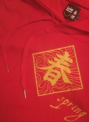
You’ll find this mark on the inside of the neckline.
Close to the body.
Not immediately visible to others—but always present to the person wearing it.
That placement matters to us.
Because before joy is expressed outwardly, it is felt inwardly.
Before it is seen, it is lived.
In the end, none of these decisions were made in isolation.
They were shaped by a single question:
How do we make something that reflects not just what joy looks like—but how it is lived?
joie theory :) 喜理 is our answer to that question.
Still evolving.
Still being stitched together.