


Store
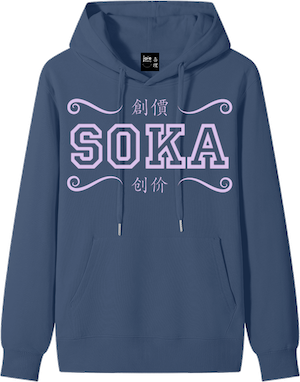
Soka Hoodie
Premium Heavyweight 100% Cotton Buddhist Soka Streetwear - Transform poison into medicine
$88
"Soka" translates to Value Creation. This philosophy is rooted in the belief that within every challenge lies the potential for growth. It is the active process of finding meaning in our struggles and enhancing our own lives — no matter the circumstances. This design brings this philosophy to life through the vibrant imagery of a radiating lemon being transformed into a refreshing glass of lemonade. It serves as a visual illustration of the Buddhist concept of "changing poison into medicine" — reminding us that we possess the inherent power to turn our most "sour" experiences into something sweet, nourishing, and impactful for the world.
This collection explores the transformative power of Buddhist practice as a lived, dynamic force—one that begins within and radiates outward into every aspect of life.
Each piece reflects a core principle: that our inner state, our actions, and our environment are deeply interconnected, and that through consistent practice, we can transform even the most difficult circumstances into sources of strength, meaning, and growth.
Daimoku (題目) represents the awakening of one’s inner voice—the act of chanting as a “lion’s roar,” calling forth courage, clarity, and life force. It is the starting point: a declaration that one’s life has power, presence, and the capacity to influence the world.
Ichinen Sanzen (一念三千) expresses the profound principle that a single moment of intention contains infinite potential. Paired with the imagery of storm and lighthouse, it reflects the ability to transform karma into mission—to illuminate direction even amid uncertainty, and to recognize that within each moment lies the power to change the course of one’s life.
Renge (蓮華), the lotus, embodies the simultaneity of cause and effect—the truth that even in the depths of winter, the potential for spring is already present. It is a reminder that growth and awakening do not wait for perfect conditions, but arise precisely through them.
Soka (創價), meaning value creation, brings this journey into everyday life. Through the principle of transforming poison into medicine, it affirms that challenges, when engaged with wisdom and creativity, become the very source of joy, contribution, and renewal.
Kakumei (革命), or [Human] Revolution, is the engine of this transformation. It is the conviction that a fundamental change in a single individual’s life can change the destiny of all humankind. It represents the process of breaking through one’s own limitations and bringing forth infinite potential to create a life of absolute happiness and value for the world.
Together, these teachings form a continuous cycle of awakening: to call forth one’s life, to direct it with intention, to trust in its unfolding, to create value from all circumstances, and to revolutionize our very state of being. Expressed through symbolic imagery and thoughtful design, this collection is an invitation to engage deeply with one’s own practice—to transform, to illuminate, and ultimately, to live with resilience, purpose, and boundless possibility.
Front: 創價 [Traditional] / 创价 [Simplified] — Soka (Value Creation). Flowing swirls curl inward at the edges, symbolizing the drawing in and transformation of external forces — where challenges are internalized and re-created into value.
Back: 變毒為藥 [Traditional] / 变毒为药 [Simplified] — Changing Poison into Medicine. Featuring a radiating lemon half and a glass of lemonade with ice cubes in bright, cheerful ink colors.
Furthermore, the clean, modern typography for 'Soka' signifies the contemporary application of these ancient values.
Typography: The front English text is set in Allstar, an athletic block typeface often associated with classic American varsity lettering. Chosen for its bold, structured presence, it reflects the spirit of collective effort, discipline, and shared striving—values deeply embedded in both sports culture and the movement for kosen-rufu. As the United States marked the first expansion of this movement beyond Japan, this typographic choice also honors the unique role of American practitioners in advancing a global vision of peace, dialogue, and human connection. It further evokes Daisaku Ikeda’s fond recollections of his formative days at Toda University, where learning, camaraderie, and shared purpose shaped the foundation of his lifelong commitment as he "ran" alongside his mentor in life. In this way, the varsity lettering also resonates with the spirit of what practitioners today may experience as “Ikeda University” — a living space of growth, mentorship, and human revolution expressed through daily practice.
The Chinese text on both the front and back is rendered in Kai-style calligraphy, preserving the elegance and clarity of traditional forms. Rooted in classical brush traditions, Kai script offers balance, legibility, and a sense of grounded continuity—bridging ancient wisdom with present-day expression.
On the reverse, the English text appears in Wildsoul, a hand-drawn script chosen for its organic, unrestrained quality. Its expressive, free-flowing lines evoke a sense of authenticity and individuality—an openness to grow, transform, and be fully oneself. This spirit mirrors the natural world referenced throughout the collection, recalling the effortless vitality of flowering forms such as peach, plum, and damson blossoms.
Together, these typographic elements create a dialogue between structure and freedom, tradition and emergence—reflecting the path of practice itself: rooted in discipline, yet unfolding into boundless, self-expressive life.
Palette: Lilac was chosen as the principal text color for its quiet presence and symbolic resonance. As a flowering hue, it carries a gentle echo of the lotus—suggesting awakening, softness, and the unfolding of insight. It also sits within the broader purple spectrum alongside indigo, creating a visual continuity with the teachings on deepening practice—where color, like understanding, becomes richer over time.
To preserve the clarity and primacy of the text, the palette is intentionally restrained. Aside from lilac, a single complementary tone is used for accompanying imagery, allowing visual elements to support rather than compete with the words. These visual elements appear in bright white or sunlit yellow — colors that introduce a sense of illumination, clarity, and awakening. White reflects purity and presence, while yellow evokes light, insight, and the radiance of understanding.
This minimal yet intentional palette reflects the discipline of practice itself: removing excess so that meaning may come forward with greater focus, depth, and light.
Fabric Colors: The use of Cornflower Blue and Slate Indigo represents the vastness of the universe and the depth of spiritual practice. Indigo itself carries a dual significance—both as a color and as a flowering plant—bridging the material and symbolic worlds. As a dye derived from living leaves, it reflects transformation through process: what begins as green deepens, over time and repetition, into a rich and enduring blue.
Nichiren Daishonin quotes T'ien Tai as stating, "From the indigo, an even deeper blue." and builds upon that by elaborating: "This passage means that, if one dyes something repeatedly in indigo, it becomes even bluer than the indigo leaves. The Lotus Sutra is like the indigo, and the strength of one's practice is like the deepening blue." In this way, indigo becomes not only a color choice, but a metaphor for sustained practice—where depth is cultivated gradually and intentionally.
Cornflower Blue introduces a complementary botanical note. As a flowering form, it subtly echoes the symbolism of the lotus — an enduring emblem in Buddhist thought of awakening, purity, and emergence from the depths. In this way, the palette not only reflects the deepening of practice, but also the blossoming of insight.
joie theory :) 喜理 is a curated line of ethical, heavyweight 100% cotton streetwear and intentional apparel utilizing sustainable water-based printing and recycled packaging. Primarily designed by Gloria Ng, the collection draws creative inspiration from her spiritual practice and cross-cultural heritage — collaborating with her children and her mother to bring a multi-generational perspective to every piece.
After recovering operational costs, net proceeds are dedicated to causes close to her heart: Black Joy proceeds contribute toward her children’s college funds, Lunar New Year Greetings proceeds support her mother’s elder care, and Buddhist Inspirations proceeds support annual Buddhist conference funds to deepen embodiment of the practice, with any surplus reinvested into the community.
Each hoodie features our signature square label with stitched smile logo on the inner neckline tag, representing the philosophy of finding joy and resilience in every moment.
- Premium 100% Cotton, high-density heavyweight fabric
- 300 GSM offering a substantial, high-quality feel with year-round breathability
- Modern oversized fit with long sleeves and drop shoulder styling
- Premium streetwear silhouette featuring a front pocket and Round neck / O-Neck design
- Versatile staple for home, outdoor, and daily casual wear
- Ideal for autumn, winter, or cool seasonal transitions
- Printed with eco-friendly, soft-hand water-based inks for vibrant, long-lasting designs
- Unisex fit
- Made to order
- Machine wash at 30°C / 86°F (gentle cycle)
- Do not bleach
- Air dry, if desired
- Tumble dry low
- Iron at low temperature (avoid ironing directly on print)
- Do not dry clean
We are committed to sustainability across our entire production process. Inks are water-based, non-toxic, biodegradable, and free from harmful chemicals, making them a safer and more environmentally responsible alternative to traditional inks.
These inks work by bonding directly with the 100% cotton fabric fibers, allowing the print to become part of the fabric itself, which helps maintain its softness while also improving durability over time.
Print Size: Up to 40 x 52 cm for high-impact visual depth.
Wash Resistance: Water-based inks are designed to cure into the fabric during the printing process. Once properly set, they can withstand repeated washing without significant fading or cracking per standard garment care. So you can enjoy both the comfort and longevity of your selected hoodie(s) without compromising on environmental values.
Our commitment to climate action is woven into every aspect of our production. We utilize ethical, heavyweight 100% cotton, ensuring durability and a reduced environmental footprint compared to synthetic alternatives.
Our printing process exclusively uses non-toxic, water-based inks, which are biodegradable and free from harmful chemicals. This significantly reduces water pollution and chemical waste.
Furthermore, all our packaging materials are eco-friendly and made from recycled content, minimizing our contribution to landfill waste. We believe in a circular economy and strive to reduce our impact at every stage, from sourcing to delivery.
By choosing **joie theory :) 喜理**, you're supporting a brand dedicated to sustainable practices and a lighter environmental footprint.
Batch variations are normal due to factors like temperature and materials, and we strive to minimize these differences as much as possible. We appreciate your understanding.
Each piece is made especially for you.
Beyond printing, we also use eco-friendly and recycled materials in our packaging. Our goal is to build an apparel supply chain that reduces waste and supports a lighter environmental footprint.
Orders typically arrive within 10–17 business days from the time your order is placed. Delivery times may vary slightly depending on location and seasonal demand.
You’ll receive tracking as soon as your order is on its way. Please note that applicable sales tax is calculated at checkout. For California residents, a sales tax of 10.75% will be applied to your order.
International Orders: Any customs duties, import taxes, or VAT fees required by your destination country are the responsibility of the recipient and are typically collected by your local postal service at the time of delivery.